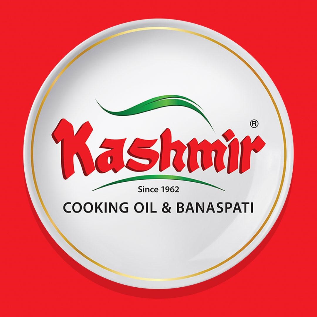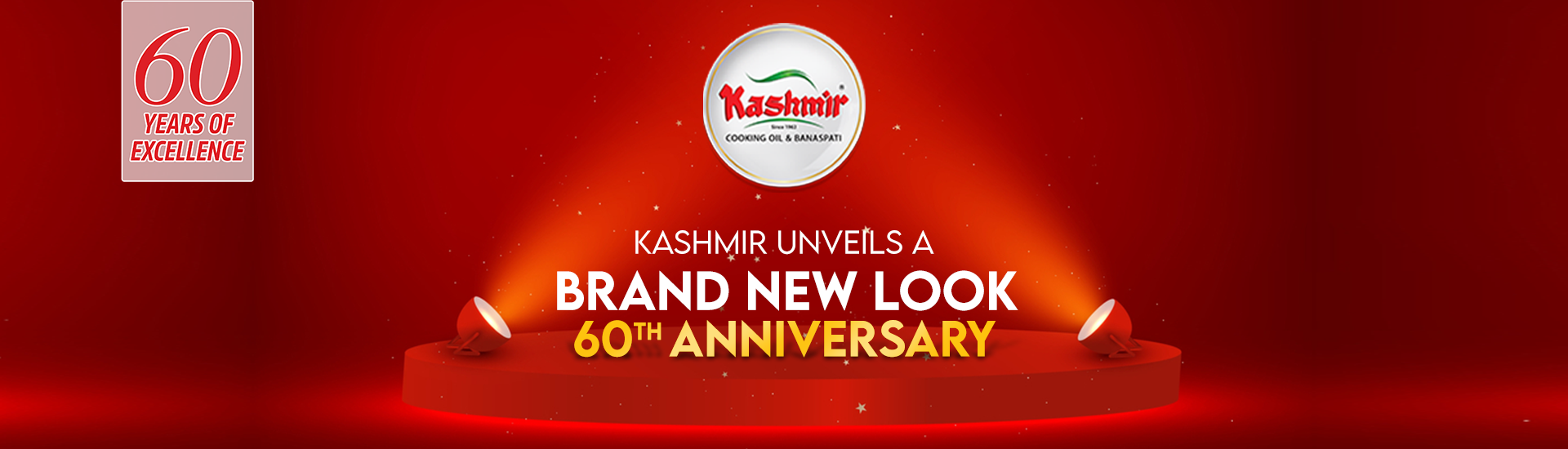
The New Look of Kashmir Cooking Oil and Banaspati-
We are thrilled to unveil our latest campaign- “Riwayaton ka naya rung”, a celebration of 60 years of tradition and excellence, breathing new life into Kashmir’s age-old flavor and traditions. We honor our past while embracing the future, introducing a fresh new look that symbolizes togetherness through our all-natural products. Through our latest packaging, not only is our visual identity revamped but we’re also expressing our commitment and dedication to health and the environment. The three variants of Kashmir now share a single flag, capturing the beauty of their traditions all together. Through our distinct logo and our brand identity, we have brought our classic, rich in heritage and flavorful food to you as a tribute to our values.
The Design Direction-
Transforming our traditional branding into a more modern one, we have also taken up a more minimalistic approach with a distinct color palette, elevating our food visuals. An important change is the usage of red, the core color from our brand, which is done to signify our identity and to ensure the packaging stands out. In extension to that, bold typography, primary colors, and delicate gold rings combined have changed not only our layout but have also ensured a unique personality for Kashmir.
The Packaging Design-
- It enhances convenience, a feature exemplified by our Kashmir Premium Gold's new design.
- We're also excited to introduce a value-driven bulk pack, tailored for those seeking value in larger purchases.
- In a defining move to align more closely with our brand, the colour of KPG has been transformed from purple to red, distinctive of Kashmir.
- The incorporation of a golden ring into our plate for KPG and Banaspati Gold is more than a design choice; it's a statement of premium quality, symbolizing the finest dishes traditionally reserved for celebrations and festivities.
- These refinements are more than mere changes; they are part of a greater challenge aimed at fostering connections and bringing loved ones together. This belief is encapsulated in our philosophy, “Riwayaton ka naya rung”.